App Builder \ Screens
Dashboard

App Builder & Automation Expert
Stay Updated with ProcFu!
Subscribe to our newsletter for the latest tips, updates, and automation insights.
Subscribe NowDashboard Mobile View


The ProcFu Dashboard offers a powerful and flexible way to visualize and manage your data with customizable widgets. The dashboard uses Google Charts for rendering, providing a rich and interactive user experience.
Dashboard Interface

- Name: Assign a name to the screen.
- Public: Check this to make the screen public. Public screens can be accessed by the entire internet, so be cautious.
- Cache Time: By default, it is set to 3600 seconds (1 hour). This means your data will be updated once per hour. You can reduce it for faster data updates, but this may impact performance. We advise setting the cache time to a reasonable limit.
- Add: Click to add a new widget.
- Refresh: Click to refresh changes on the dashboard.
Widget Interface

- Title: Assign a title to the widget.
- Width: Specify the width of the widget. By default, it is set to 25, meaning 25% of the screen width. For example, setting it to 50 will make the widget occupy 50% of the screen width.
- Left/Right: Move the widget horizontally to the left or right from its current position.
- Delete: Remove the current widget.
- Widget Type: Select from 11 available widget types:
-
Options: Each dashboard widget has two options fields that accept JSON data:
- Card Options: Applied to the card containing the widget.
- Widget Options: Applied directly to the widget within the card.
- On Click: Select from the dropdown the screen you want to navigate to when clicking the widget on the dashboard.
Card Options
- This affects the card and the title. These options are simply added to the CSS style tag of the div.
- If you want to make the card background blue and the text white, here's the code:
-
{"color":"white","background":"#0000ff"} - A more modern and comprehensive example:
-
{"background":"#2a9d8f", "color":"white", "border":"1px solid black", "border-radius":"15px", "padding":"10px", "box-shadow":"0 4px 8px rgba(0, 0, 0, 0.1)", "font-size":"18px", "font-weight":"bold", "text-align":"center", "margin-bottom":"10px"}
Widget: Text Info

- As the name suggests, this widget allows you to display static text.
- Options:
- Text: This is where you input the text you'd like to display.
- Widget Options:
- For this widget, the same options that apply to the card generally apply here, as it is just text being displayed.
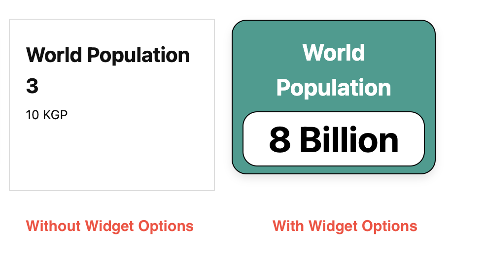
- Here is an example code to make the text look more appealing:
{"background":"white","color":"black","font-size":"36px", "font-weight":"bold", "text-align":"center", "margin-bottom":"10px","border":"1px solid black", "border-radius":"15px"} - Output:
Widget: Simple Value
- This widget displays a simple value. Similar to the Text Info widget, but the value can be dynamic rather than hardcoded. There are three different sources to choose the value from: PF Variable, SQL Query & Podio Report Widget
- Here's a screenshot of the three different widgets using three different sources.
-
PF Variable
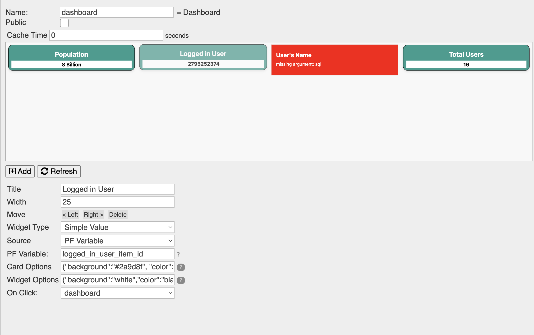
- This will display a simple value stored in a PF Variable. For example, if you want to display
the name of the logged-in user, you can set the name to a PF Variable using the
var_setfunction in thebefore-processevent and then call it here in the PF Variable field. - Options
- Source: Choose PF Variable from the options.
- PF Variable: This is where you input the previously set PF Variable.
- Example: Display the logged-in user's name.
- Before-Process Screen:
-
var_set("logged_in_user_item_id",json_encode(" "+auth_item["item_id"])) - The
is used here to prevent the item_id from being displayed as a number with a thousand separator instead of as text. - PF Variable Field: logged_in_user_item_id
- This will display a simple value stored in a PF Variable. For example, if you want to display
the name of the logged-in user, you can set the name to a PF Variable using the
-
SQL Query
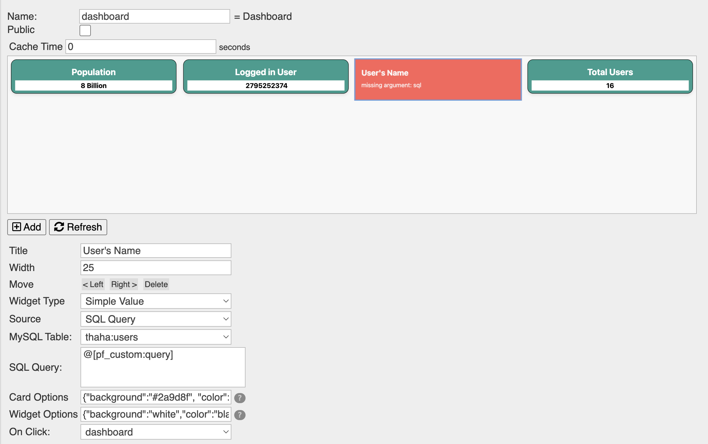
- If you have Data Syncs feature and use SQL tables integrated with procFu, you can get a value from the table via an SQL query.
- Options
- Source: Choose SQL Query from the dropdown options.
- MySQL Table: Choose the required table from the dropdown options.
- SQL Query: Either write the query directly here if it is static or use a PF custom token that represents the query.
- Example: Now that we have the logged-in user's
item_idfrom the previous example, let us go ahead and query the MySQL table for the user's name using this item_id. (This requires Data Syncs and MySQL integration)- Before-Process Screen:
- I'll query the SQL table to get the user's name where the user's id will be dynamically passed using concatenation.
-
custom_tokens.query = "SELECT `title`, `item_id` FROM `users` WHERE `item_id` = '"+auth_item["item_id"]+"'"; - SQL Query Field: @[pf_custom:query]
- This widget will display an error message in red stating "missing argument: sql" in the preview. This is normal behavior because the SQL query is only executed in the real environment, not in the preview.
-
Podio Report Widget
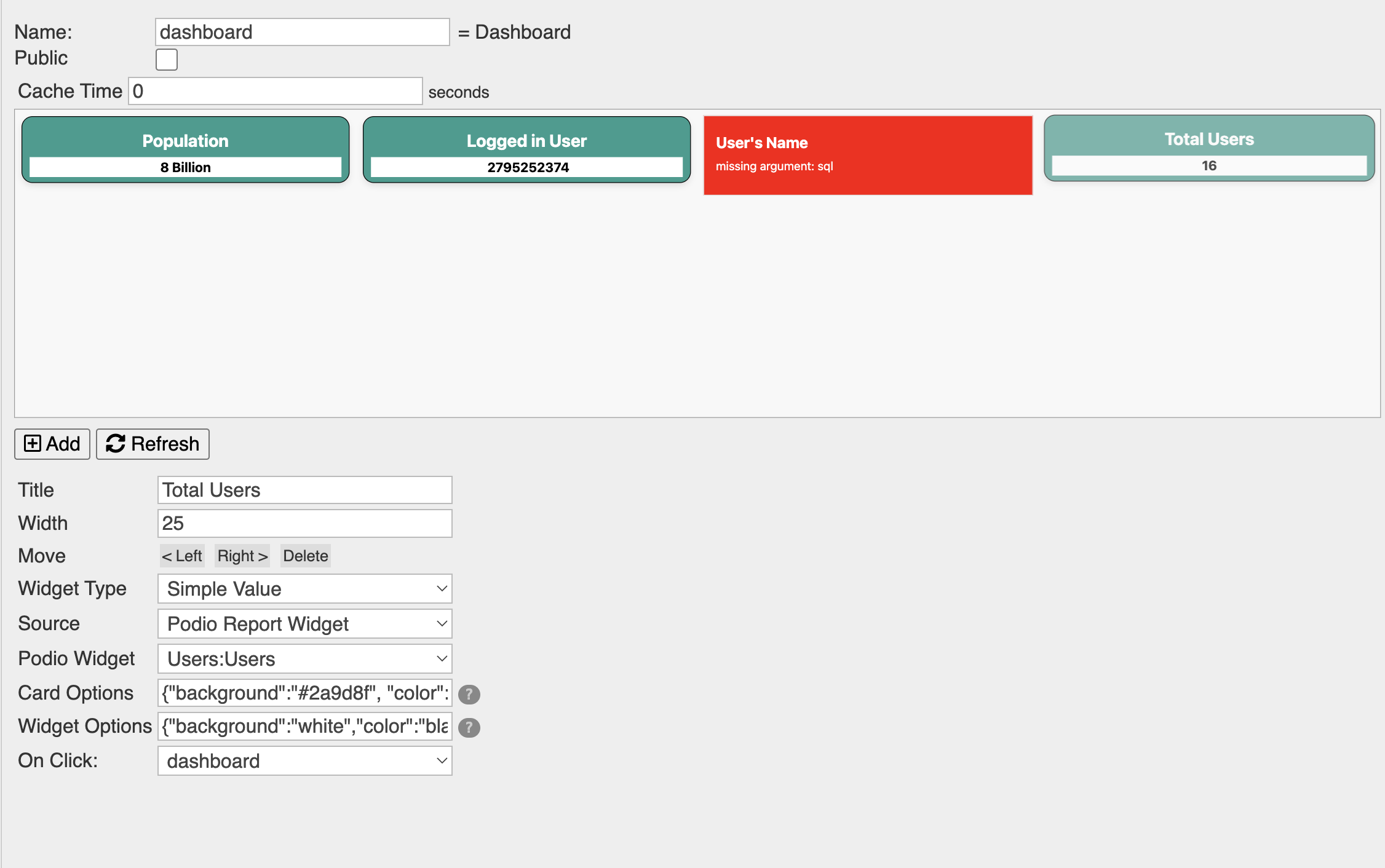
- This can display a value from the Podio Report Widget.
- Options
- Source: Choose Podio Report Widget from the options.
- Podio Widget: Select the required Podio Report Widget from the dropdown options.
- Example: Display the total number of users in this table.
- Widget Options
- The same options that apply to the Text Info widget also apply here.

Widget: Progress Bar / Gauge

- This widget displays a graphical representation of a number's completion status. For example, if the number is 20, then 20% of the progress bar or gauge will be highlighted as completed.
- There are three sources from which you can choose the value:
- PF Variable
- SQL Query
- Podio Report Widget
- The value must be a number. If it is text, the dashboard will throw an error, resulting in a blank screen.
- Options
- Source: Select the source from which to retrieve the value:
- PF Variable: Input the previously set PF Variable here.
- MySQL Table: Choose the required table from the dropdown options.
- SQL Query: Enter the query directly if it is static, or use a PF custom token to represent the query.
- Podio Widget: Select the required Podio Report Widget from the dropdown options.
- Source: Select the source from which to retrieve the value:
- Widget Options
- Several styling options are available for this widget:
- background: Sets the color of the background of the bar (the incomplete part).
- color: Sets the color of the bar (the completed part).
- min: Specifies the minimum percentage of the bar that is completed. For example, if the actual value is 16 and the minimum is set to 20, the bar will display 20% complete.
- max: Defines the maximum value of the bar. By default, progress is calculated out of 100. If your maximum value is higher, set it here. For instance, if the maximum is 150, the bar will show 50% completion when the value is 75.
- Conditional Coloring: Allows for dynamic color changes based on value ranges. For example, `{"color":"<2=red,2-10=blue,10+=green"}` will display red if the value is less than 2, blue if between 2 and 10, and green if greater than 10.
-
Examples
- This section provides examples of both a Progress Bar Chart and a Gauge Chart.
- For the Progress Bar Chart, we'll use data from a PF variable. For the Gauge Chart, we'll fetch data using an SQL query.
-
Before-Process code to fetch or set requried data:
// Set progress to 100 out of a maximum of 150, representing approximately 66% completion. var_set("progress_bar", json_encode(100)); // MySQL Query to get user count for Progress Bar custom_tokens.query2 = "SELECT COUNT(*) AS user_count FROM `users`"; -
Card Options for Progress Bar & Gauge:
{"background":"#f5f5f5","color":"black", "text-align":"center","border":"2px solid black"} -
Widget Options for Progress Bar: Configure the maximum value and set
conditional colors.
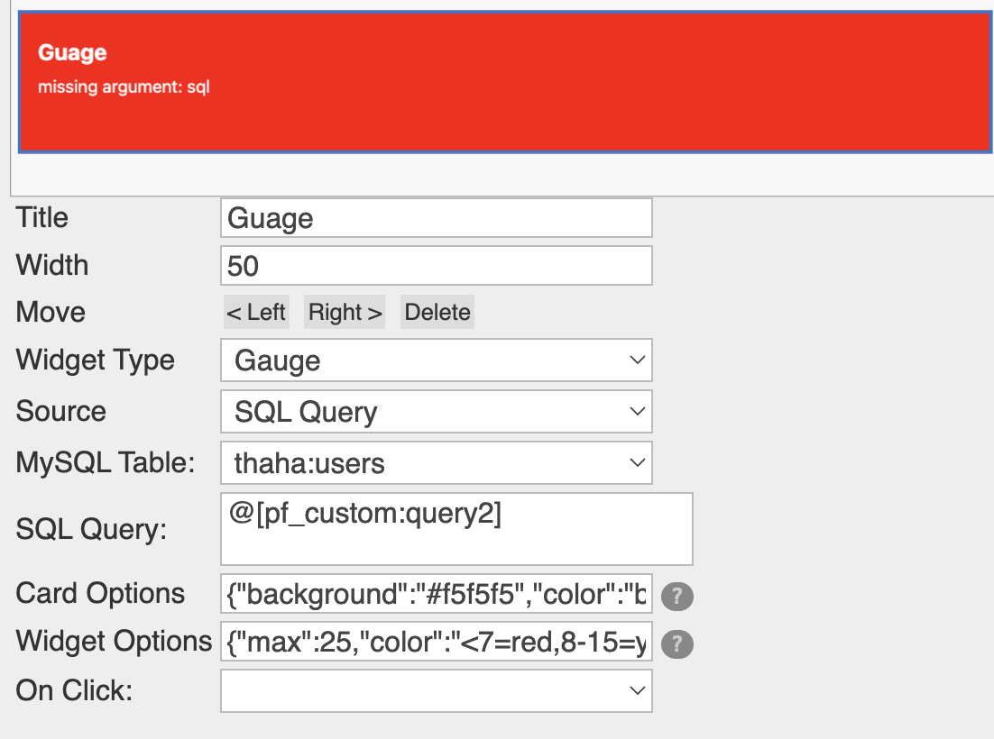
{"max":150,"color":"<30=red,31-60=yellow,61+=black","margin-top":"20px"}The maximum value for the progress bar is set to 150. The color of the bar changes based on the progress:
- Less than 30: Red
- 31 to 60: Yellow
- 61 and above: Black
-
Widget Options for Gauge: Configure the maximum value and set conditional
colors.
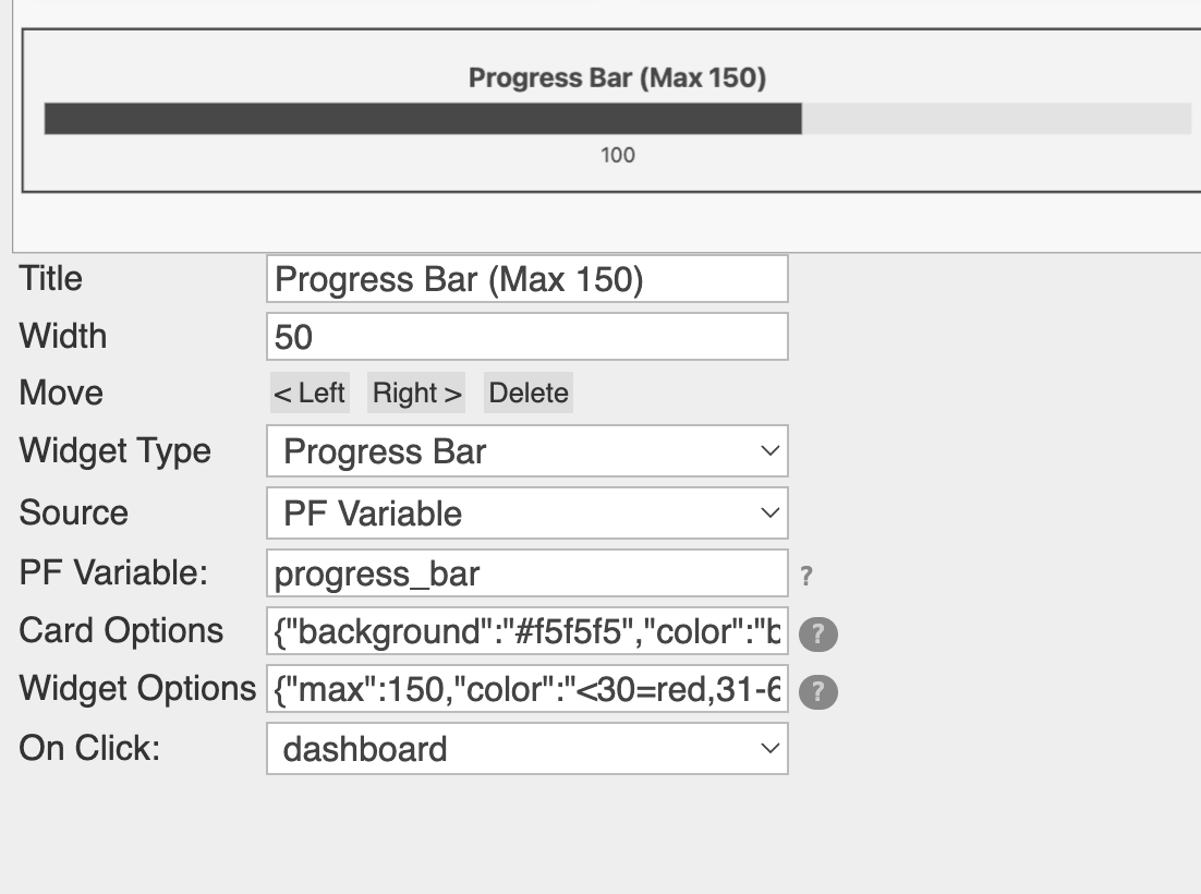
{"max":25,"color":"<7=red,8-15=yellow,15+=green","margin-top":"20px"}For the gauge, the maximum value is set to 25. The color changes based on the value:
- Less than 7: Red
- 8 to 15: Yellow
- 16 and above: Green
Widget: Bar Chart / Column Chart / Pie Chart / Line Chart
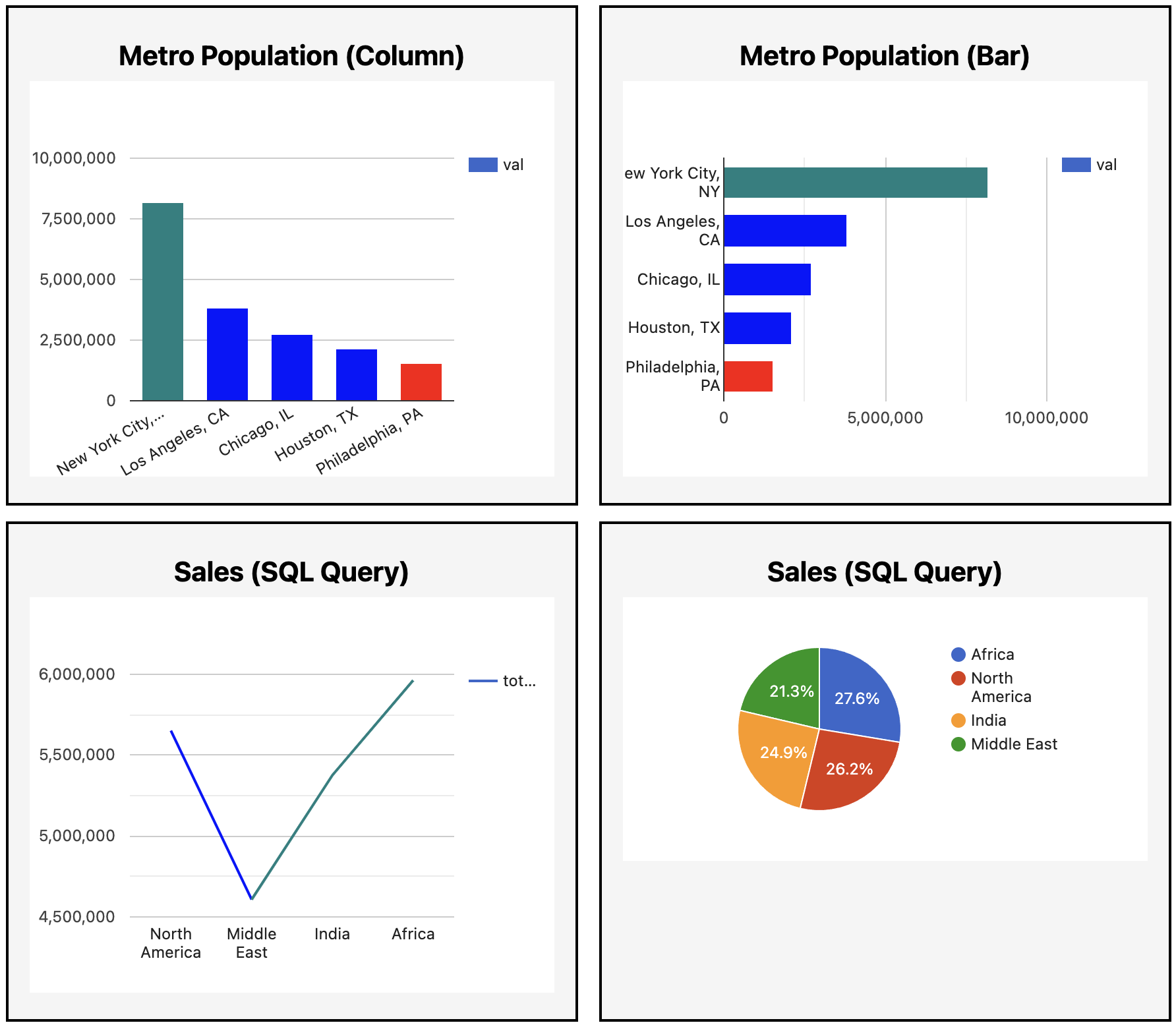
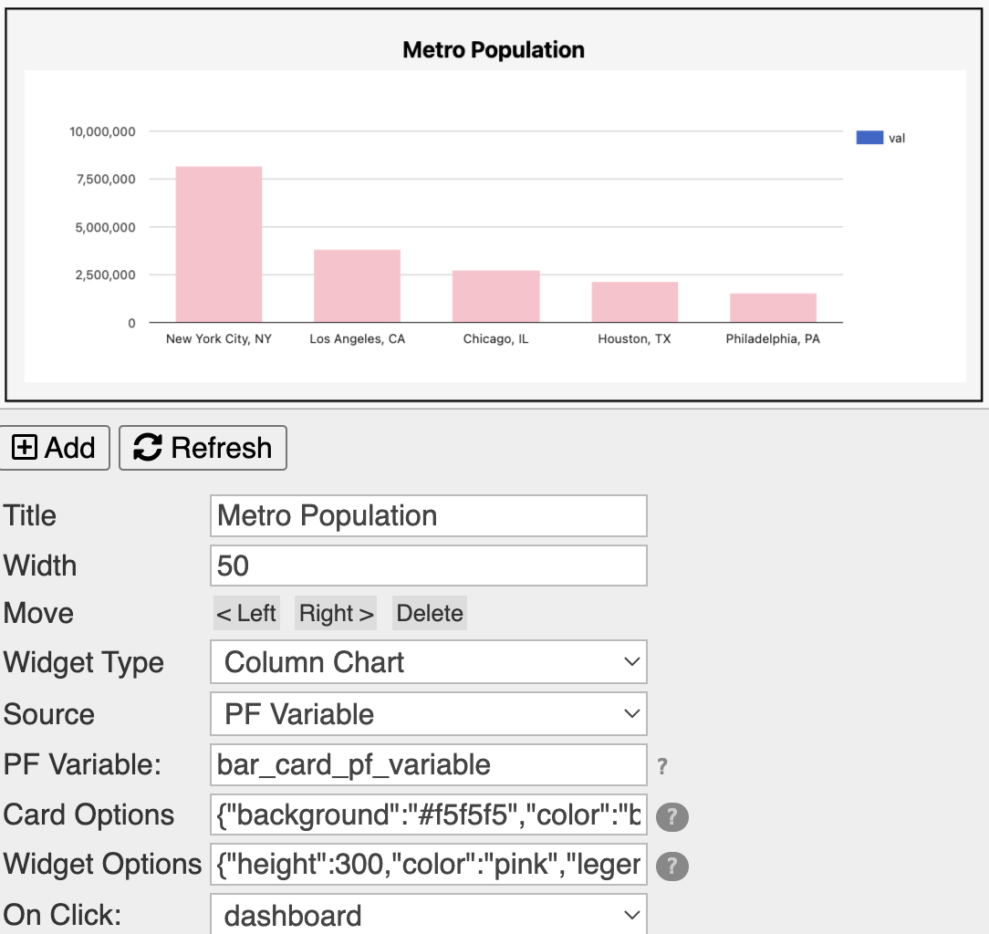
- This widget displays a bar/column/line chart. You can choose from five different data sources to populate the chart: PF Variable, SQL Query, Podio Report Widget, Podio View, and InfoLobby Table.
- The difference between a bar chart and a column chart is that a bar chart has horizontal bars, while a column chart has vertical bars. A line chart is a chart that displays data as a series of points connected by straight line segments.
- Widget Options
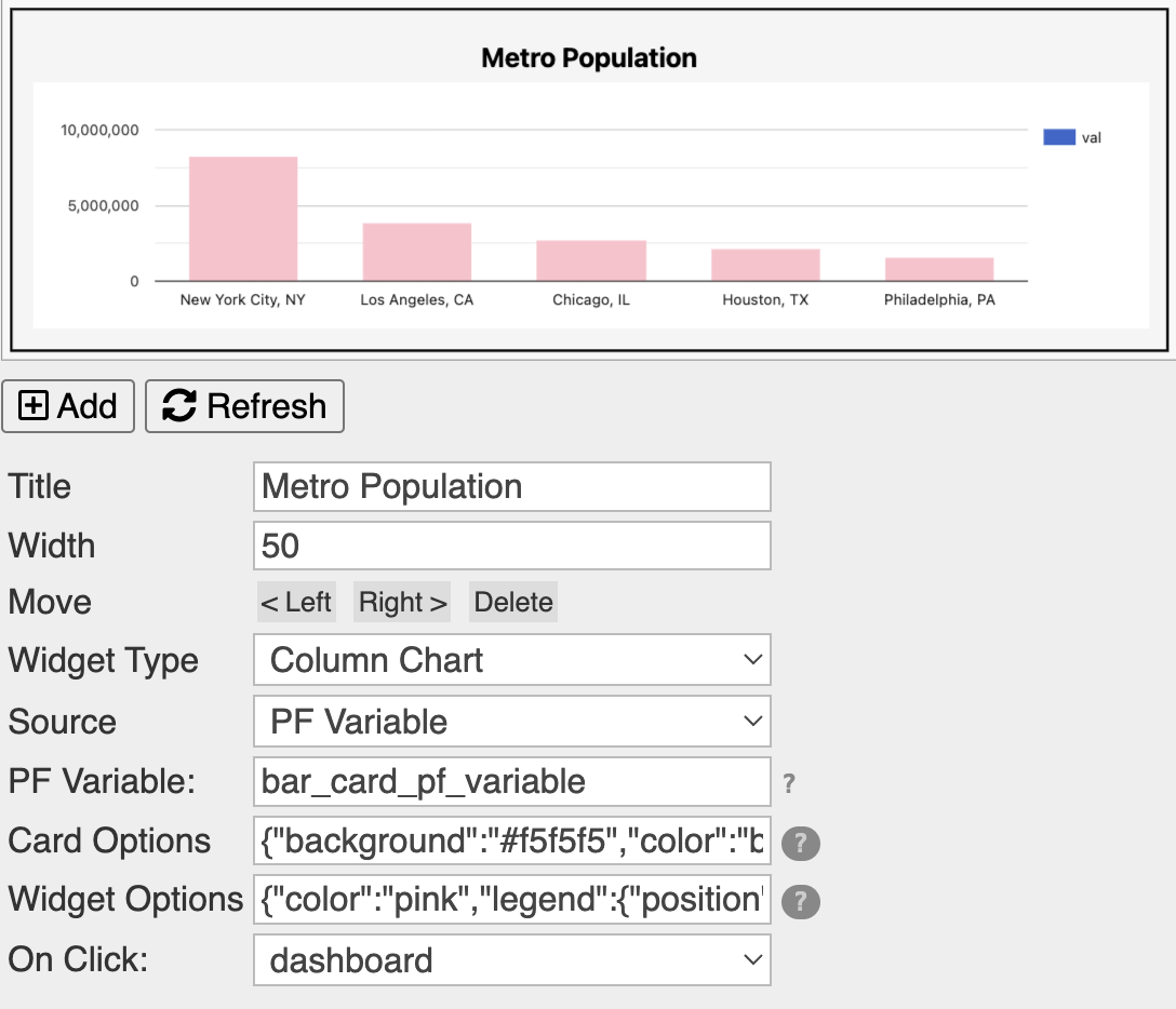
- You can pass a JSON object to the Widget Options field to customize the chart. Known options include setting bar colors, legend position, chart height, etc.
- For example:
{"color":"pink","legend":{"position":"right"}} -
If your axis values are skipping numbers, it’s likely because the height or width is too small to accommodate all the numbers. You can adjust this by setting a larger height or width in the JSON, such as
(See the right image above).{"height":300}
-
PF Variable
- If you want the bar chart to be constructed using PF Variables, you can do so. Here's an example of the code in the before-process event to construct such a chart:
$data = [ 'New York City, NY' => 8175000, 'Los Angeles, CA' => 3792000, 'Chicago, IL' => 2695000, 'Houston, TX' => 2099000, 'Philadelphia, PA' => 1526000 ]; var_set("bar_card_pf_variable", json_encode($data)); - You can use the variable name
bar_card_pf_variablein the PF Variable field.
Podio View / InfoLobby Table
- If you want the bar chart to be constructed from a Podio View or InfoLobby Table, you can do so. The following are the options you need to set:
- Source: Podio View / InfoLobby Table
- Podio View / InfoLobby Table: Select the required Podio View / InfoLobby Table from the dropdown options.
- Key Field: Here's where you give the podio field's External ID or InfoLobby Table column name that will be used to construct the chart.
- Value Field: Here's where you give the podio field's External ID or InfoLobby Table column name that will be used to construct the chart.

Podio Report Widget
- If you want the bar chart to be constructed from a Podio Report Widget, you can do so. The following are the options you need to set:
- Source: Podio Report Widget
- Podio Widget: Select the required Podio Report Widget from the dropdown options.

SQL Query
- If you want the bar chart to be constructed from an SQL Query, you can do so. The following are the options you need to set:
- Source: SQL Query
- MySQL Table: Select the required MySQL Table from the dropdown options.
- SQL Query: Enter the query directly if it is static or use a PF custom token that represents the query.
- For example, if you want to get the regional sales data, you can pass the PF custom token
@[pf_custom:chart_query]to the SQL Query field. - In the
before-processevent, you can set the PF custom token like this:

custom_tokens["chart_query"] = "SELECT `region`, SUM(`sales`) AS total_sales FROM `sales-data` GROUP BY `region` ORDER BY total_sales DESC";Widget: Podio Widget Table


- This widget displays a table from constructed from a Podio Widget's data.
- Options
- Widget: Select the required Podio Widget from the dropdown options.
- Widget Options: This is where you can set the options for the Podio Widget.
- total_label: This is the label to display for the total value.
- decimals: This is the number of decimal places to display for all the values.
{"total_label":"Overall Sum","decimals":2}
Widget: SQL Table

- This widget displays a table from constructed from an SQL Query.
- Options
- MySQL Table: Select the required MySQL Table from the dropdown options.
- SQL Query: Enter the query directly if it is static or use a PF custom token that represents the query.
- For example, if you want to get the regional sales data, you can pass the PF custom token
@[pf_custom:chart_query]to the SQL Query field. - In the
before-processevent, you can set the PF custom token like this:
custom_tokens["table_query"] = "SELECT `region`, SUM(`sales`) AS total_sales FROM `sales-data` GROUP BY `region` ORDER BY total_sales DESC";
Widget: Podio Detail Table

- This widget displays a table from constructed from a Podio Detail Table.
- Options
- Podio App: Select the required Podio App from the dropdown options.
- Podio View: Select the required Podio View from the dropdown options.
- Fields: A comma separated list of the fields to display in the table.
- Labels: A comma separated list of the labels to represent the column headers in the table.
CSS Customization to make the dashboard look better in mobile screens
While setting less than 100% widtth for the widgets looks good in the desktop, it doesn't look good in mobile screens. So, we need to add some CSS to make the dashboard look good in mobile screens.
To do this, you can add the following CSS to the header event of the dashboard screen.
What is basically happening here is that we are making the widgets wrap to the next row and setting the width of the widgets to 100% on mobile screens.
For the selected widgets, we are setting the width to 50% or other custom width as you see fit. To do that you'll have to inspect the widget in the dev console and get the data-wid number for that widget.
<style>
    @media (max-width: 768px) {

        /* make widgets wrap to the next row */
        .zui-row {
            flex-wrap: wrap !important;
        }

        /* make widgets take 100% width on mobile */
        .zui-card-outer {
            width: 100% !important;
            min-width: 100% !important;
            max-width: 100% !important;

        }

        /* set custom width for widgets for selected widgets */
        /* You can get the data-wid number by inspecting the widget in the dev console */
        .zui-card-outer[data-wid="0"],
        .zui-card-outer[data-wid="1"],
        .zui-card-outer[data-wid="2"],
        .zui-card-outer[data-wid="3"] {
            width: 50% !important;
            min-width: 50% !important;
            max-width: 50% !important;
        }
    }
</style>
Conditional Coloring
You can set conditional coloring for the widgets. For example, you can set the color of the bar to red if the value is less than 10, yellow if the value is between 10 and 20, and green if the value is greater than 20.
You can set the conditional coloring in the Widget Options field.
For example:
{"color":"<10=red,10-20=yellow,20+=green"}This is applicable for the following widgets:
- Progress Bar
- Gauge
- Simple Value
- Text Info
- Bar Chart
- Column Chart